Milestone Event Productions Logo Concept

Milestone Event Productions was a brand/company that never lifted its wings beyond the concepting stage.

I was a freelance designer at the time in early 2017 and was tasked with creating a logo for the hypothetical company. Client wanted something impactful like the memories they helped document on video.

The Client wanted the M to be large and center. At the time orange and black were to be the colors, however the challenge was incorporating “a splash of orange” to the already bold M we working with.

He were some more unorthodox approaches before we were completely sold on the M being the main emblem for the logo. Admittedly this was an awkward phase for the logo, but growing pains are necessary for any concept!

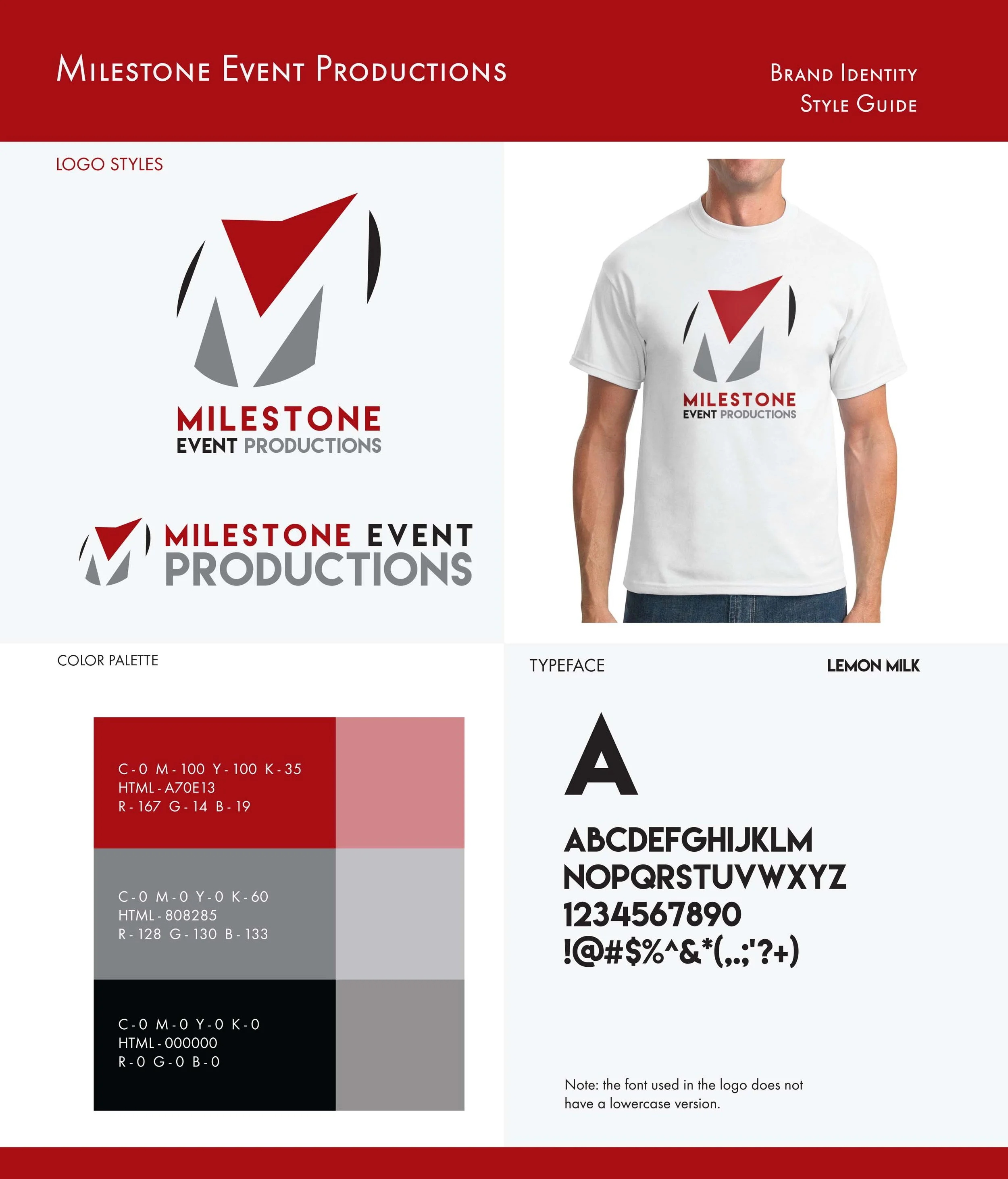
Tiered event packages were a business model for Milestone, so we explored how we could have the logo be applied to such a direction. Making sure that the color was not dependent on a specific color was key. Once the client realized this, color exploration was widened. Lastly, the M was tilted into perspective for a more dynamic flair. The flat M we initially worked with was very static and was dropped.

And finally with our dynamic M figured out, we figured on a bold carmine red for our final color. Here was the style sheet at the time of a company that never was, but only existed through some logo art. Thanks for reading!

Previous
Previous

Bronco Activation

Next
Next

Travel Delta Campaign